Auré
Bio-Regenerative Skincare
SERVICES
Creative Direction
Brand Transformation
Shopify Website
Custom Packaging
Social Media Design
Fractional Design Partner
[ BRAND STORY ]
“Most Skincare Focuses on Correction. Auré Focuses on Regeneration.”
For years, founder Sanela worked with women to build sustainable approaches to health, rooted in consistency, balance, and lasting results rather than short-term fixes.
She observed that most skincare brands operated in opposition to this philosophy: complex routines, aggressive actives, and constant correction that often left skin more reactive than resilient.
Auré was created as an alternative. A system designed to work in harmony with the skin's essential processes, cultivating a complexion that grows stronger, smoother, brighter, and more resilient with time.
[ THE PROCESS ]
With the mission and formulations established, Sanela approached me to craft a brand system that was at once minimal and expansive—capable of supporting growth and future product extensions. We drew inspiration from the formulas themselves, paring back until every design element served a deliberate purpose.
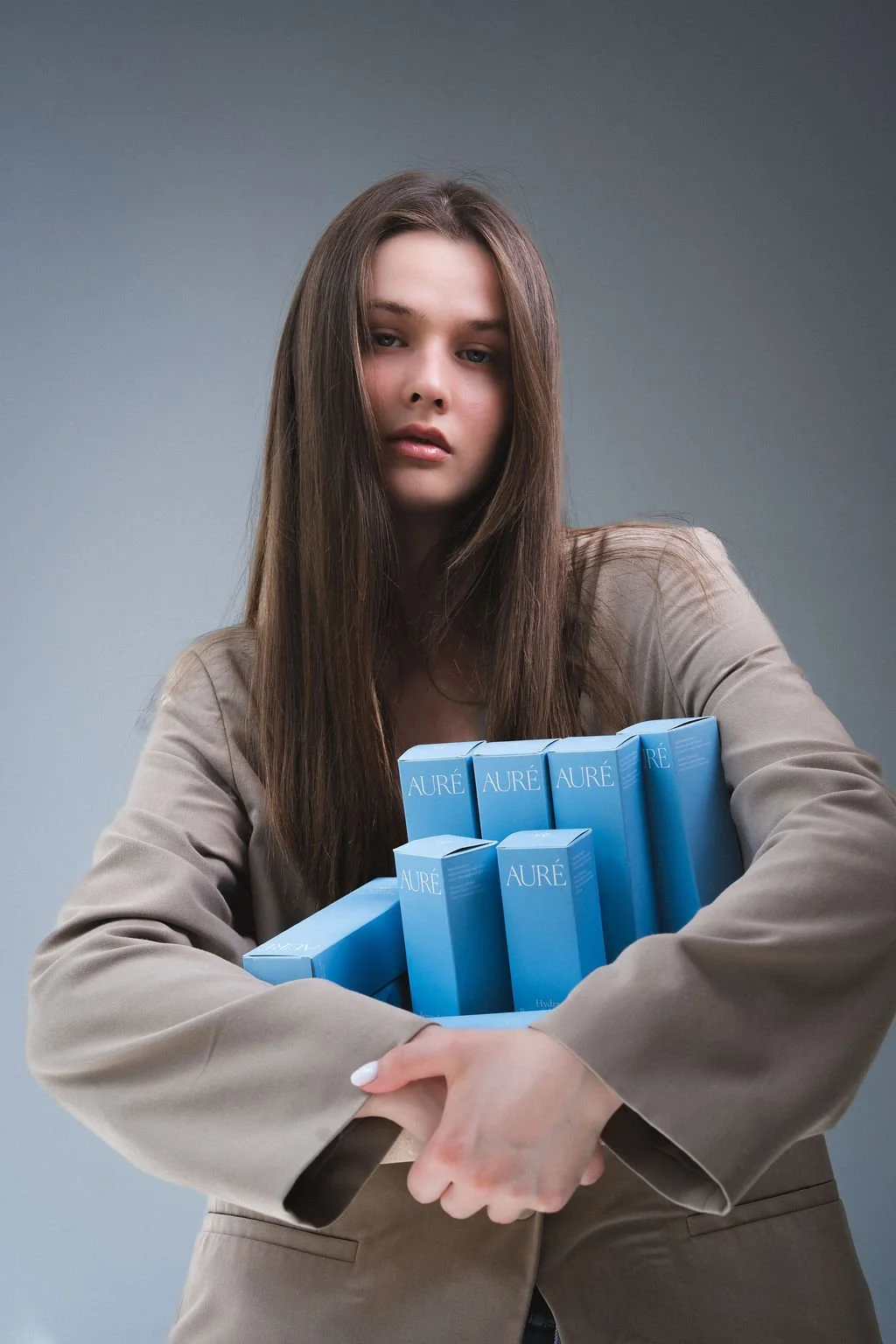
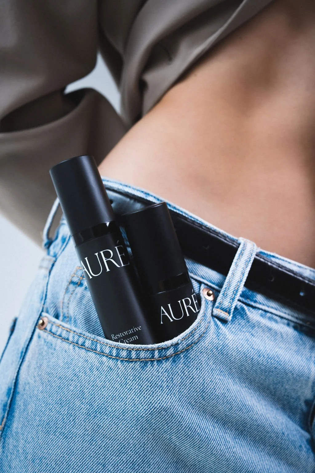
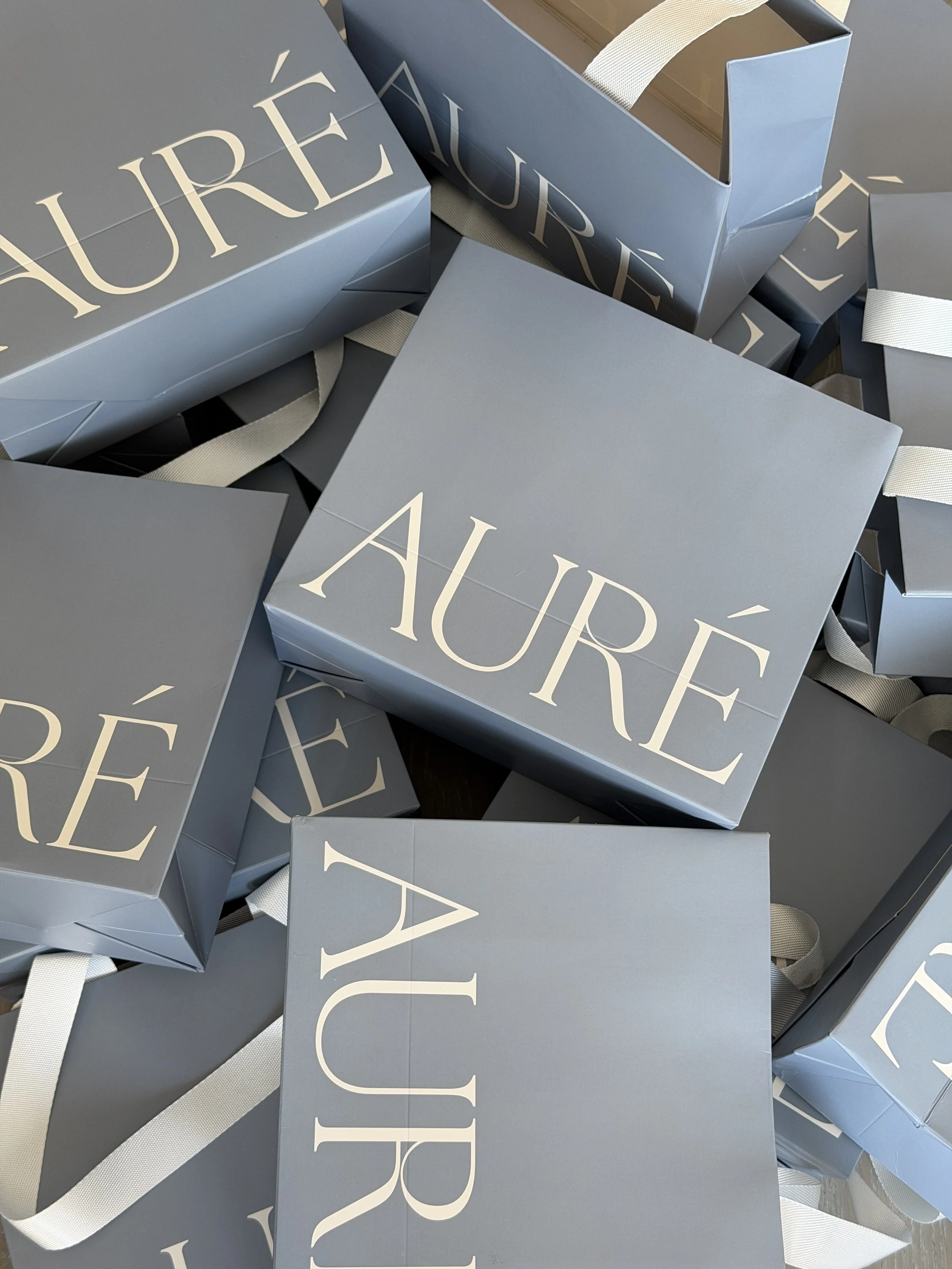
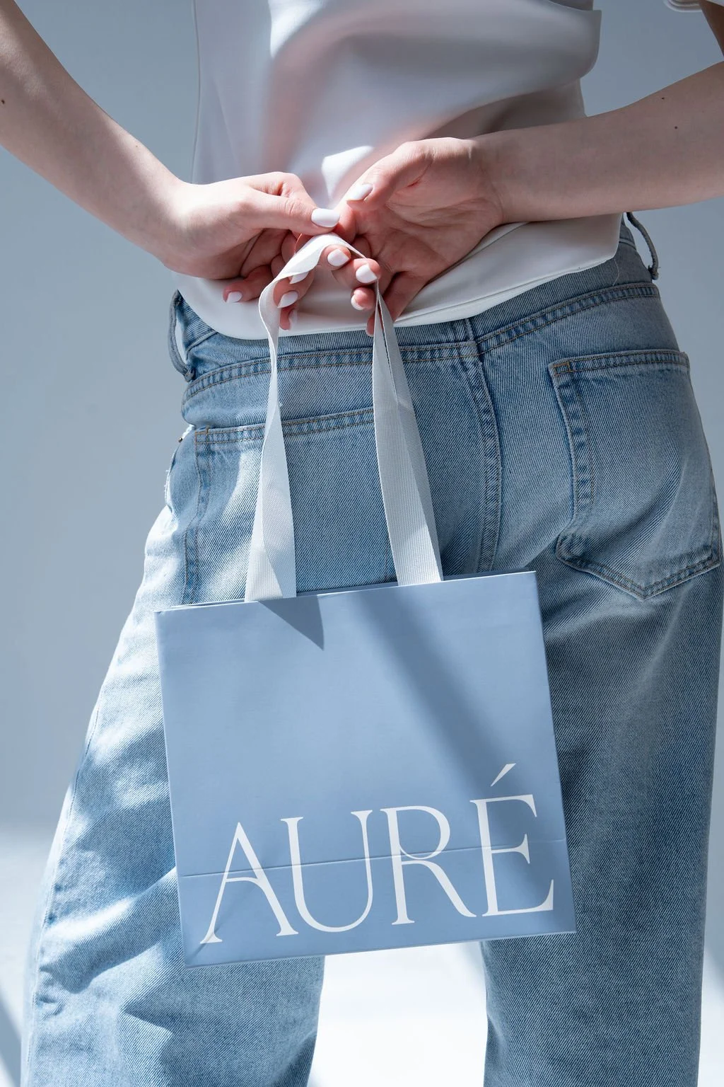
The result is a custom wordmark with subtle, distinctive refinements—an elevated, understated mark that echoes the products' ethos. Rather than an expansive palette, we anchored the brand in neutrals and black, then introduced two signature blues as the defining brand colours. These shades recur across packaging and marketing materials to create immediate, cohesive recognition.
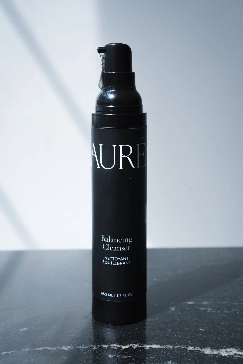
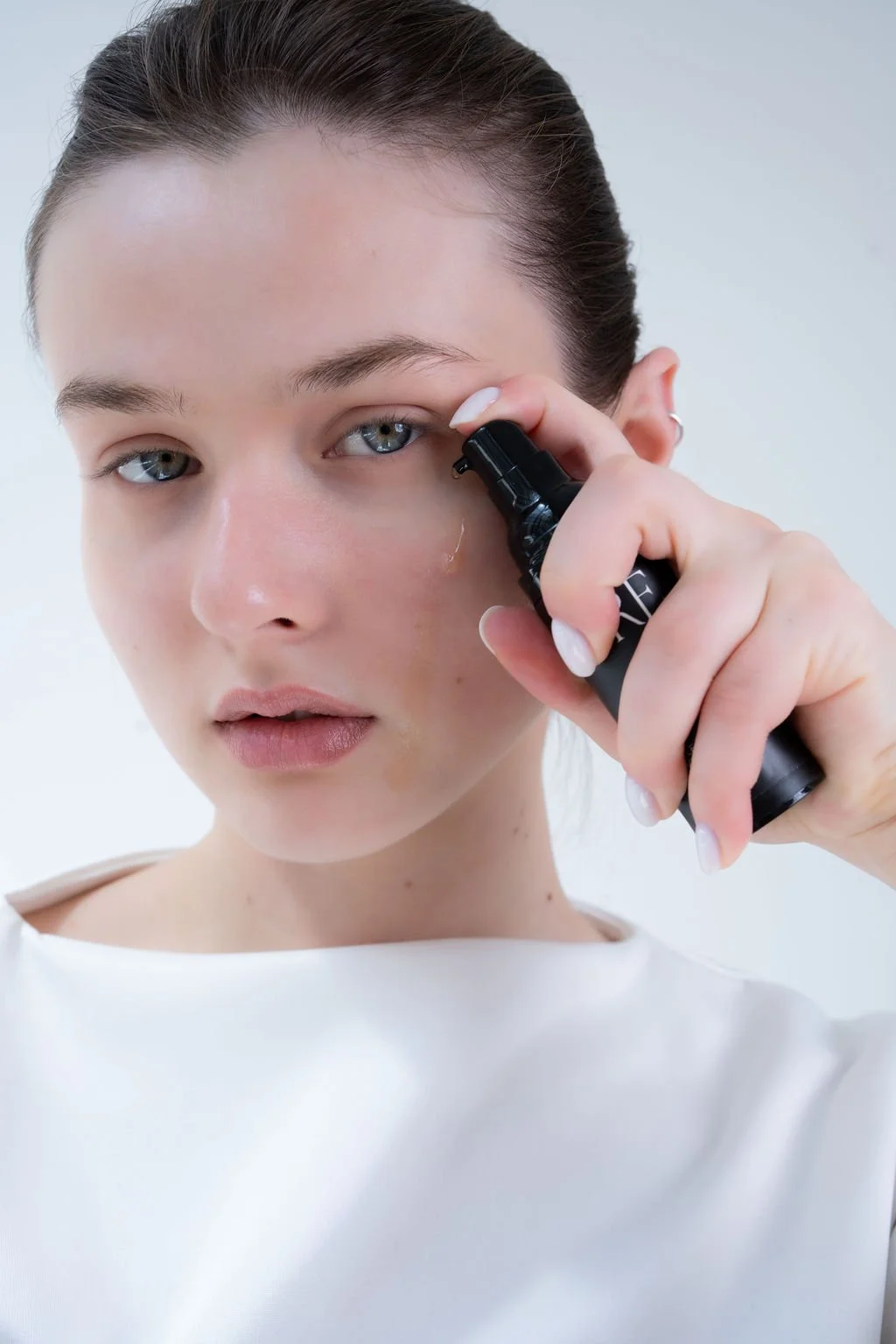
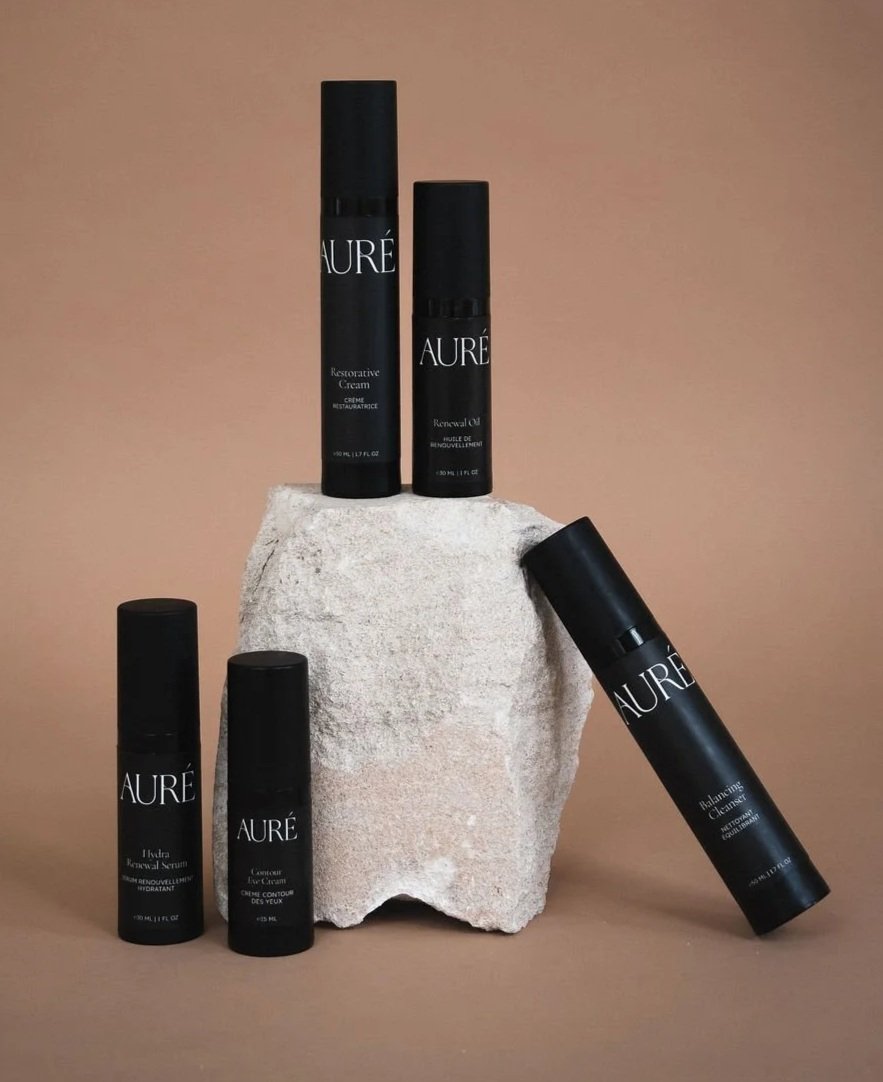
In parallel, we developed a restrained packaging system. The logo commands presence, scaled prominently, while all other elements remain minimal and approachable. Bottles are sleek and black; external packaging features the primary blue to reinforce brand identity on shelf and online.
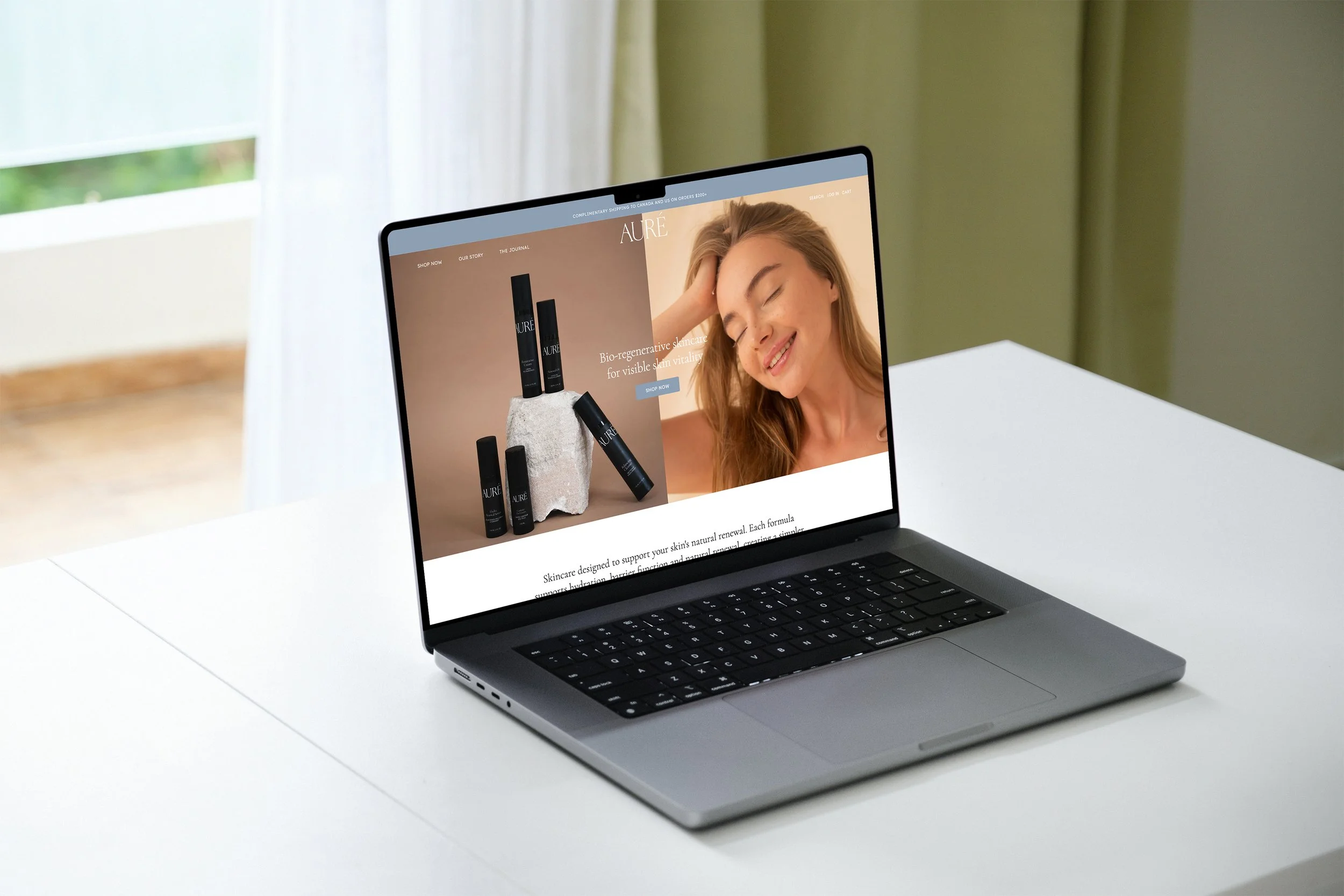
To bring the brand to market, we also designed and built a custom Shopify site—crafted to educate customers on the philosophy and formulations while providing a seamless, elevated path to purchase.